Overview
Overview is the answer to two questions: where do I stand? and what should I do next? It’s the first thing you see when you sign in, and the place you’ll return to most. It’s a navigation surface first — its job is to get you to the right dashboard in one click — and a data surface second.
Four dashboard cards
Section titled “Four dashboard cards”Across the top, one card per dashboard — Posture, Compliance / CCM, Testing & Validation, and Environment & People — each blending a real snapshot with a plain‑English status line, so you don’t have to click through to see whether something needs attention. There is deliberately no fifth “overall” card and no composite score sitting above or between them: every dashboard is scored independently, and Overview never invents a blended number to summarise them.
- Posture shows a small severity sliver (critical/high/medium/low) and how many of the four posture lanes are live.
- Compliance / CCM shows per‑framework readiness bars.
- Testing & Validation shows your validation coverage in miniature.
- Environment & People shows a small thumbnail of your asset/org graph.
Each card links straight through to its full dashboard.

What’s New
Section titled “What’s New”A compact, low‑key feed of the most recent platform updates — new capabilities, enhancements, and what’s coming — each tagged New, Enhanced, or Coming. It sits below the four dashboard cards and above Act on this / Beware of this. It’s a quiet reference, not a banner competing for your attention.

Snapshot indicators and status tags
Section titled “Snapshot indicators and status tags”Signals across every dashboard are tagged by how they’re derived, so you always know how much to trust them:
| Tag | Meaning |
|---|---|
| Scored | A real, calculated score. |
| Live | A live count pulled from your data. |
| In development | The feature genuinely isn’t built yet. |
| Not configured | The feature is live and built, but you haven’t set it up yet (for example, Cloud posture before you’ve connected a provider). One click away, not a roadmap item. |
This honesty is deliberate: you’ll never see an invented figure presented as fact, and you’ll never see “in development” used to describe something that’s actually just waiting on you to connect it.
What each score means: the precise definitions for the calculated scores are maintained centrally so they stay consistent across the platform. Where a number looks surprising, open the linked area to see the findings behind it.
Act on this
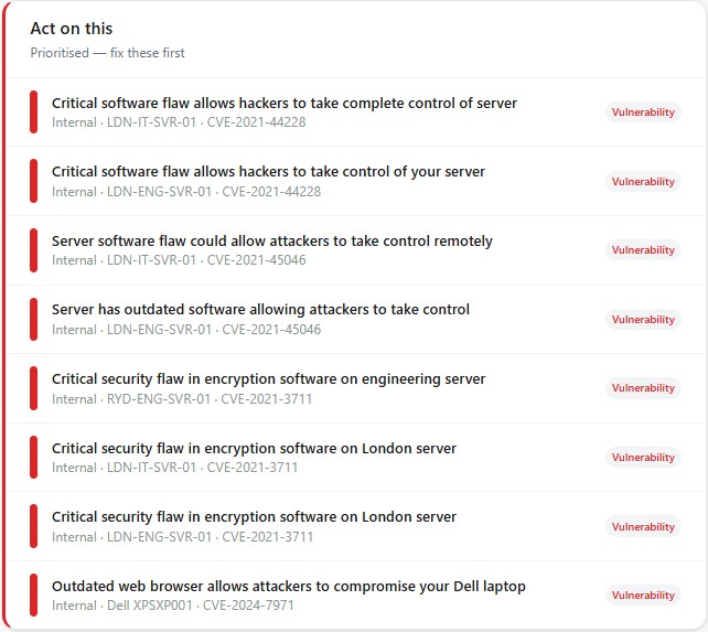
Section titled “Act on this”Your prioritised to‑do list — the things most worth your attention right now:
- Critical and high‑severity vulnerabilities
- Failed scans
- Open compliance controls
Each item links straight to where you fix it, so the dashboard doubles as your work queue.
Beware of this
Section titled “Beware of this”A feed of recent threats and exposure to be aware of, newest first — for example a newly discovered look‑alike domain, an exposed service, or a fresh credential breach affecting your people. It’s awareness rather than a to‑do list; use it to stay ahead of what’s changing.
Why it matters
Section titled “Why it matters”For everyday security: Overview turns scattered signals into a single, ranked list of what to do — useful even if compliance is not yet on your radar.
For compliance: “Act on this” surfaces open controls and failed checks directly, so closing items from Overview steadily improves your assessment scores and builds the evidence trail regulators and customers expect.
Next: Environment & People →